Trish Stewart is an Orewa-based clairvoyant/intuitive. Trish has helped hundreds of people make positive changes in their lives. Clients go to Trish because they are looking for solutions and clarity. They may know what they want in life but are unclear on how to get there.
Change of business direction
Trish was in the same position when it came to her business website. She decided that she wanted her core business to align better with her values and strengths. Once she decided to change her direction, she felt her branding and messaging weren’t going to get her there.
The site’s UX or user experiences also meant Trish’s clients were unclear on how to get the products that are for sale on the site.
Positive changes to a website
Trish sought our help to rebrand her website. Like Trish, Woodswork has helped hundreds of people make positive changes. Our strengths lie in website design and usability.
Rebranding a website shows that your business is evolving
The goals of Trish’s business had changed. Therefore, the way her business’ mission was conveyed also had to change. Her website’s messaging needed to be different.
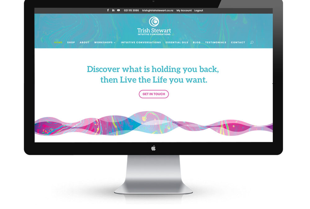
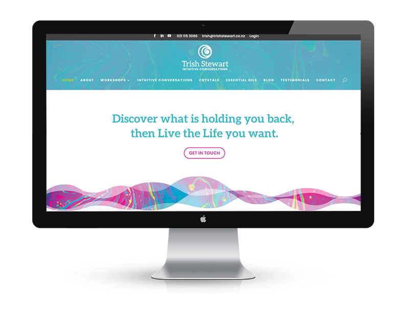
Her business had been geared toward clients needing clarity in their businesses. The shift in her business was to offer more one-to-one support on a personal level, and increasingly, her clients were women. To better connect with this new audience, she wanted to rebrand the site away from its corporate focus. The site needed a voice, look, feel and personality that appealed to this demographic. It also needed to reflect Trish and her personality.
Goals for Trish’s branding project
Trish was clear on what she wanted her rebranding strategy to achieve.
- Trish wanted to focus on a new target audience, catering to her new vision.
- The website and branding needed a refresh to be appealing.
- To keep in line with the rebranded site, digital products also needed rebranding.
- The UI needed improving to prevent confusion amongst users.
- To prevent users from dropping out of the conversion flow, the UX needed improvement.
How Woodswork helped with Trish Stewart’s rebranding strategy
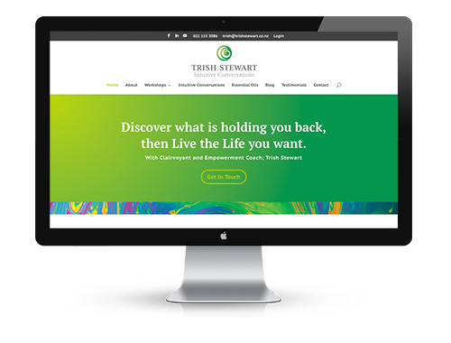
1. Logo redesign – Trish loved the tie to her Maori heritage in the koru which was already present in her logo. We didn’t want to change that aspect, as it was true to her brand. Instead, we softened the sharp green and yellow in favour of a warm turquoise. Turquoise as a stone, speaks to Trish and she feels a strong connection to it. We used the colour and images of turquoise on the site. The typeface was also changed to a fuller font with serifs that were less sharp and a larger ‘x’ height. The ‘x’ height is the height of the lowercase levels compared to the capital letters. We softened and created an open, friendly feel of the name by using lowercase letters. We also improved the legibility of the tagline ‘intuitive conversations’ by using chunky complimentary font, with a strength and solidity to it.
The softened appearance suited Trish and the change in her offerings.
Turquoise has a strong connection to the throat chakra and helps to enhance communication and expression. It also aligns all of the chakras and is often used for healing purposes. Turquoise can also help you become more open to love and forgiveness, and release patterns of self-sabotage.
2. Colours changed – The rebranded site shifted from a predominately green toning. Woodswork incorporated softer hues to give the site a more feminine feel. Trish loved the colourful marbled ink image that was already on the site. To create a connection between the old and new site, Woodswork retained the marbled ink design and selected the turquoise and pink tones from it to use throughout the new branding. A gradient overlay was used in the header to quieten the colourful marble. The same image was used in full saturation in the ‘vibration’ graphic which reflected the site’s messaging. Only Good Vibes here!
3. User experience improved – Trish Stewart offers personal empowerment online workshops with downloadable content and videos. She also sells books as digital downloads and crystal, oils and chakra card packs. However, the UX was not intuitive. The user experience of the website was flawed. Clients often got lost in what was a somewhat convoluted purchasing process. It wasn’t possible to see all she offered in one shop. Therefore, urchasing was simplified.
4. E-commerce design enhanced – The checkout flow is the most critical aspect of an e-commerce site, requiring a designer experienced in data-driven design. The Woodswork team stripped out the membership for the courses. A clean e-commerce shop was created so it was much easier to buy and receive courses. They changed the previously overly complicated digital products to a simple digital download. This simpler, tidier interface is easier for users as well as for Trish when uploading new products.
Consistent rebranding and messaging
A website’s story is just as important as the functionality and services being offered. Consumers can interact with a brand across a variety of platforms, and they expect that experience to be consistent. This is how Woodswork helped keep the site’s design, brand identity, and social media presence in sync.
1. Rebranded the course content to reflect the new site – The digital downloads, documents and online books were redesigned to reflect the new brand.
2. Rebranded Youtube covers – These now included the updated logo and colours to reflect the new site look.
3. Created a library of sympathetic photos – Social media messaging needs to be consistent, so we created a Dropbox full of sympathetic photos. Trish can easily use these on Facebook, Canva, blogs, brochures and newsletters.
4. New business card design – To reflect the changes to the branding and material, we redesigned a business card for Trish.
Rebrands ring in the changes
Your website may have gone through a rebranding because your company’s vision, mission, values, and market have evolved. Unless you know how to use your new site though, it can be stressful. This is how Woodswork helped Trish Stewart with her transition.
Custom tutorials
Woodswork created video tutorials specific to Trish’s site so she could seamlessly load the new eCommerce shop products and digital downloads.
Market repositioning
Brands are designed to connect companies with their customers. So, if you reposition your business, whether through your mission, values, or vision, your brand will need to follow suit.
Does your company need a brand overhaul?
Have there been any changes to your Orewa business that will affect your branding? Whether it’s a logo redesign, a website redesign, some refreshed messaging or a complete brand overhaul, we can help with all aspects of rebranding a business. Talk to our web design experts today to learn more about our rebranding services and how we can help your Hibiscus Coast business thrive.

