Why images and graphics are important in web design is very obvious to us here at Woodswork.
Choosing the right images and graphics for your website isn’t random; it’s integral to the success of your site. Most of what we perceive about a business via a website is visual. At Woodswork, we invest a lot of time in selecting the images that will create and reflect the look and feel of your business website’s design, no matter your budget. The attention given to your brand identity is an integral part of the site build, just as in our Mountain Country case study. How we feel about a website when we enter for the first time is paramount to a visitor’s decision to stay. It’s why images and graphics are essential in web design.
A few well-selected images will be more valuable than a whole load of irrelevant, low-quality or mixed message-sending images.
We aim to include about 4-8 images on a page. Images and graphics are essential in web design. We can use these images and graphics as assets for search engine optimisation. We rename them to include focus keywords. The keywords reflect the content and purpose of the page upon which images and graphics are placed. You can learn more about the Woodswork web design process and the impact of keywords on SEO.
Images are not all used at the same size, so we re-size them according to the required usage. This means a faster page load for your visitors and an overall faster site speed. Win, win. A variation of sizes creates a level of interest for your viewers too. We agree that it’s very appealing to have a big, beautiful, full-width image on your home page, but that could get a little boring if executed on every page. Variations of sizes and treatment of margins can create a refreshing break in content. Design is a great deal about balance.
With the amazing options out there to include AI images, it can be very tempting to use them. However, these images can be a bit on the bad taste side. Not only that they can even be incorrect! We recently tried AI to create an image recently, the results were less than fabulous. Our designer was looking for an image that required a painter to be up a ladder. Not only did it look fake, the painter had two left arms.
Sizing is where variation ends.
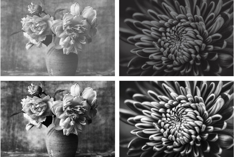
Other than the sizing, the different elements of your imagery should be sympathetic to each other. The images and graphics you choose should be the same style. The feel of the images should be consistent throughout the design. A classic example of this is the treatment of black and white photography. Although both images below are excellent in their own right, they create visual disharmony and don’t feel compatible. Both photos can still be used, but with some help in Photoshop, they can be made to look much more in line with each other.
The top two images were supplied for use on the same website. One was a colour image converted to greyscale. They are both great images, but they don’t feel cohesive. We adjusted some settings in Photoshop, and the bottom two images are now perfect together. It was a rapid change that created a completely different mood. The client was pleased with the result.
Simply attention to detail like this will improve the user experience. A better UE means longer on your site and a higher likelihood of achieving your goal.


