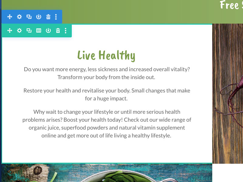
Here’s how to vertically centre content in Divi. This is so easy it’s ridiculous! All it takes is a tiny bit of code added to the CCS main Divi Style sheet.
To vertically centre content like a text module in a column
Add the following to the CSS Divi style sheet either via the Theme Customiser, in the Advanced tab > CSS in the page settings or is the CSS styles file.
/** CENTRED CONTENT IN COLUMNS **/
.et_pb_equal_columns >.et_pb_column {
margin-top:auto;
margin-bottom:auto;
}
And then the quick flick of a switch in the Row settings
Design > Sizing > Equalize Columns Heights
To vertically centre content modules in a row
To centre modules in a Divi row read the article from Elegant Themes How To Vertically Align Content.
This shows you how to add the following CSS to the Advanced section in the row or the page instead of editing the overall site CSS.
With the Equalise switch active in the Design settings now go to the Advanced tab settings for the same row and add the following css snippet under the Main Element input box for all columns or specific columns.
margin: auto;
That’s it. You’re all done : )
To equalise the height of the modules in a row
With the Equalise switch active in the Design settings the column rows need to be coloured NOT the module.
We used centred content on the following sites:
Total Health
We used equalise content on the following sites:
Here are some other tutorials and tips on positioning Divi content
How to position the Divi Blurb module icon on the right instead of the default left
If we can help you to customise the content on your Divi themed WordPress website then please get in touch with the team at Woodswork Web.


