How to fix logo stretching in Divi sites since the 4.9.6 update
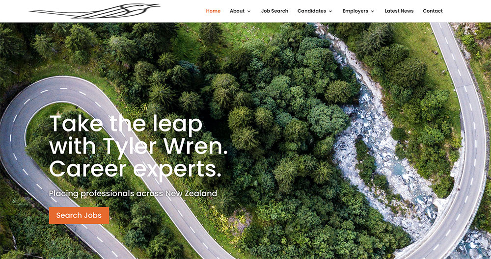
It might be just a coincidence, but since the 4.9.6 Divi update on 06-10-2021 there have been a few issues that have made it necessary for us to fix logo stretching.
I provide white label services for a couple of companies and sometimes they are not the best at doing their updates. If the client decides they want to do it themselves and not pay for it, there isn’t much you can do.
However, now and then an update comes along that can turn their world upside down. When something visual happens that effects the UX they are understandably unhappy.
The client that I white service for was unavailable at 4.30pm on a Friday afternoon and so the site owner felt the need to contact me directly.
Woodswork to the rescue!
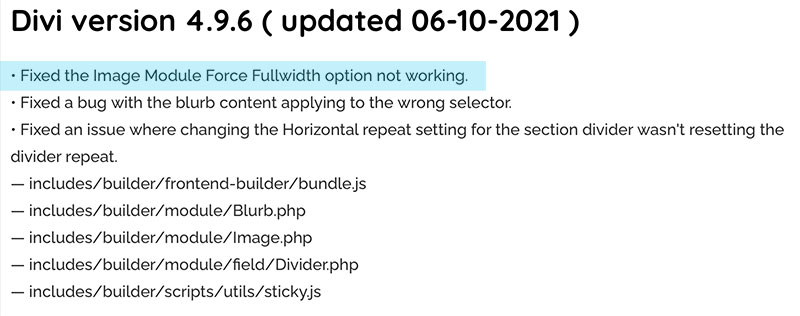
Here is a snap of the update that I think may be causing issues. It’s to do with the fix of the image module force width option. This may not be the cause but it’s interesting timing. You can read more about the Divi changelog here at Divi Gallery.
To fix it I added a little CSS I found at Divihelp on a post called ‘stop logo stretching’.
Try the below CSS in Divi > Theme Options > Custom CSS:
#logo {
width: auto!important;
}
The result, a perfect logo and a happy client! Here at Woodswork we bend over backwards to make sure our white service clients are protected. We go above and beyond when your own staff won’t. Why is that? Because we are a full service agency of dedicated specialists we are available to you any time you need us. Not just untill 4pm on Fridays!


